Wind Power Trading in Complex Terrrain:
The value of probabilistic forecasts for decision making?
An intiative by IEA Wind Task 36 and Task 51 and project WEXICOM at the Max Planck Institute for Human Development
2024-02-28 09:01:25
Ranking: Participants’ final balance in Euro
In case your nickname is not yet shown in the ranking, please wait some minutes and reload the page.
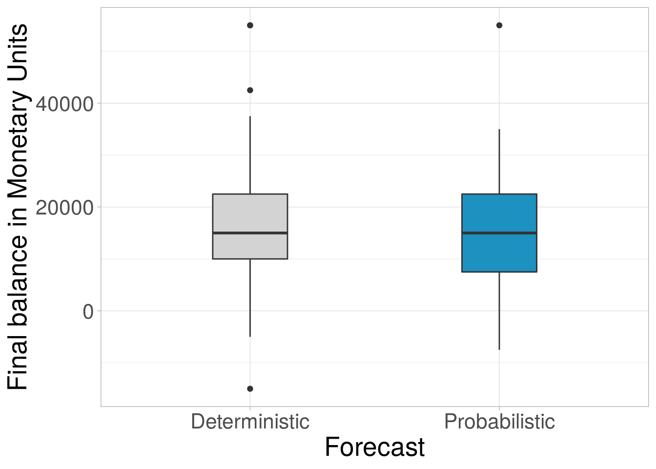
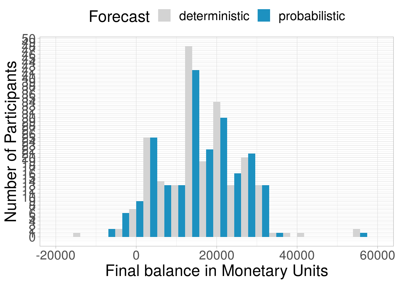
Final balance: How much money did participants make?
Participants’ final balance based on deterministic and probabilistic forecasts
The first plot shows the distribution of participants’ final balance.
The second plto shows the histogram of participants’s final balance.
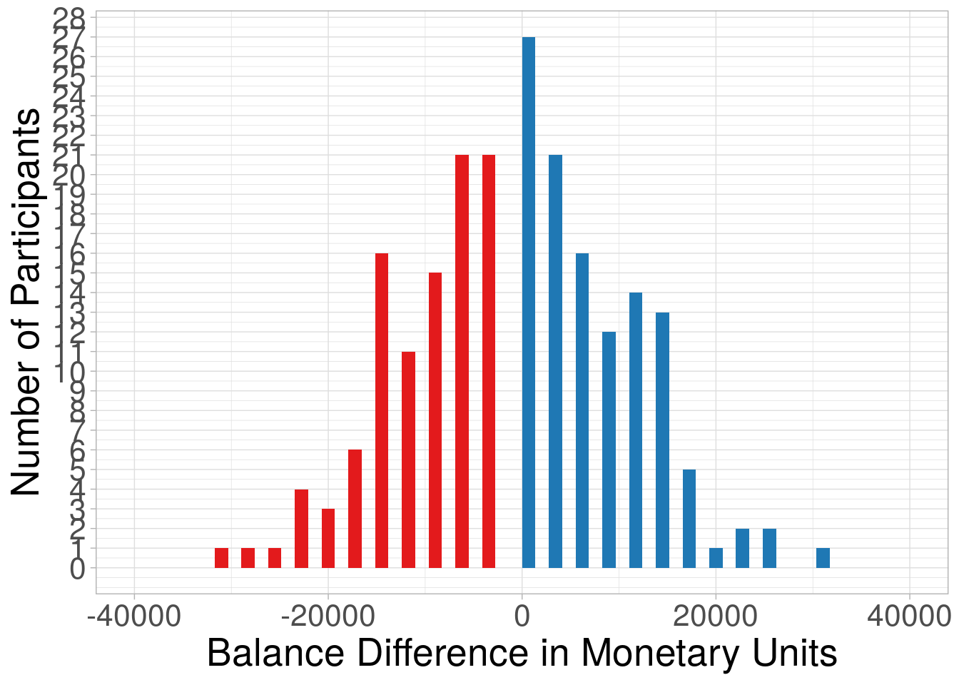
How much did participants benefit from probabilistic forecasts?
The plot shows the difference between participants’ final balance based on the probabilistic forecast and the deterministic forecast.
Blue bars (values >= 0 ) indicate that participants performed better with probabilistic forecasts. Red bars (values < 0 ) indicate that participants performed better with deterministic forecasts.
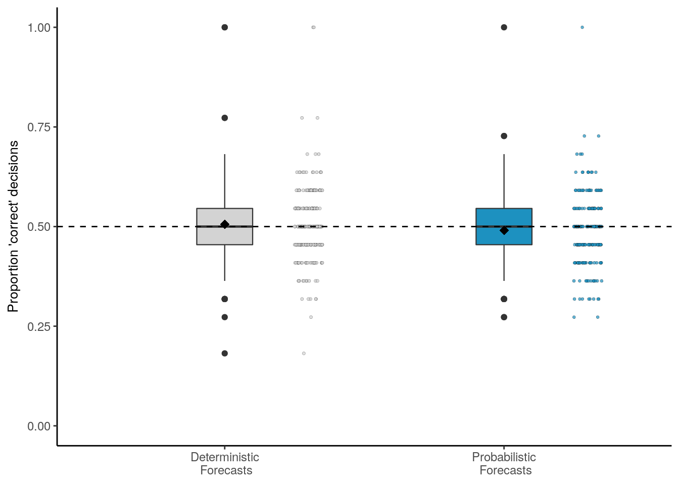
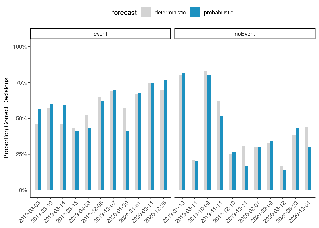
Correct decisions: How many decisions were correct?
Proportion of correct decisions based on deterministic vs. probabilistic forecasts
The first plot shows the distribution of participant’s proportion correct by forecast.
The second plot shows the proportion correct by situation.